Content
Arngren.net is a Norwegian website founded in 2002 by Arngren Electronics which is used primarily to
sell all sort of weird gadgets and appliances. The website proposes a mass collection of various items from vehicles
(eg bikes, scooter, bikes and cars) to electronic collectibles to purchase. Although the webpage achieves
its task of showcasing all of its marketable items, the user-interface is a disorganized chaos; as elaborated below.
(arngrenn, 2020)
Navigation
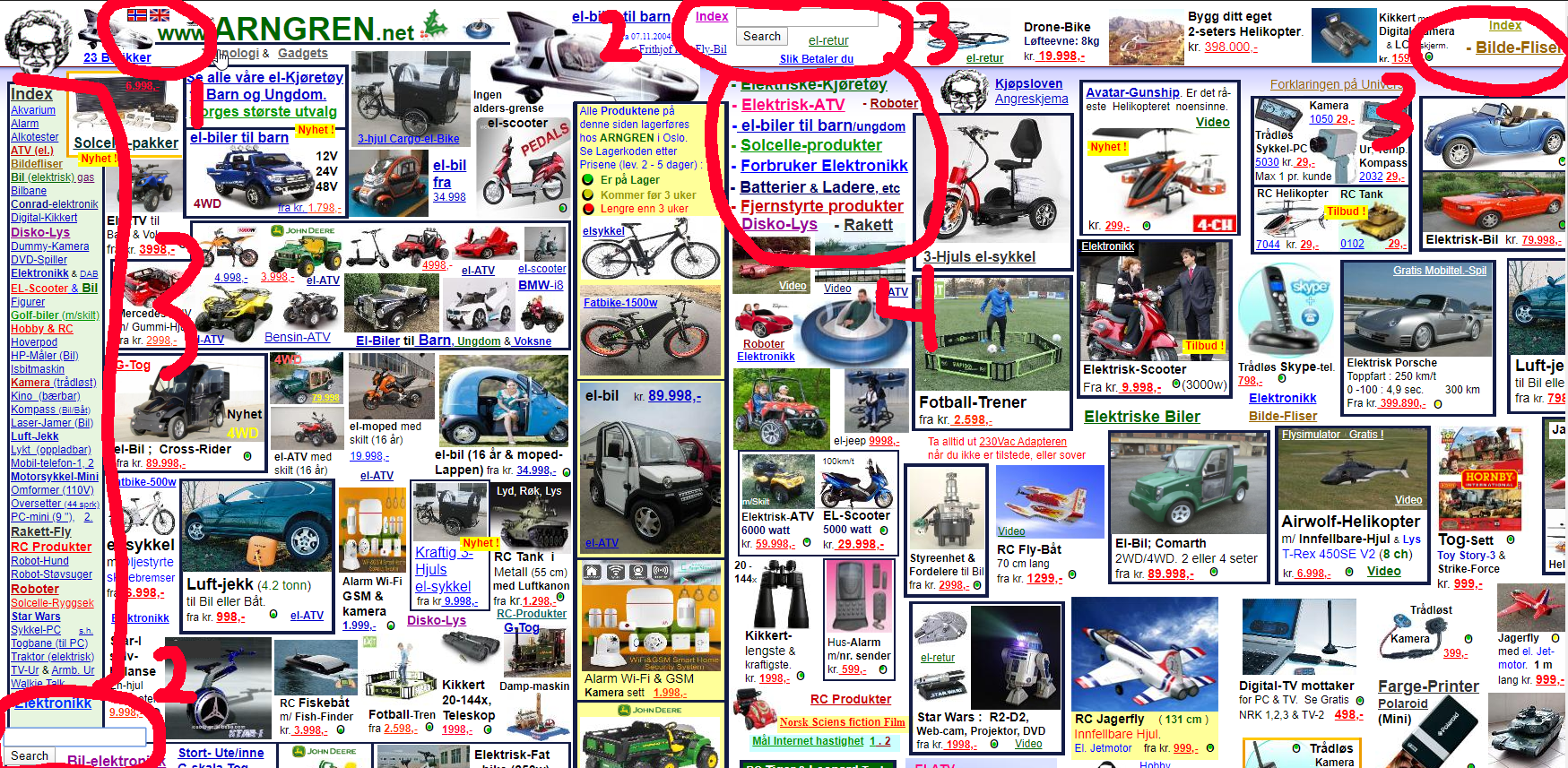
The navigation is a huge mess, at first glance you have no idea what you are looking at. Hence, the navigation is atrocious; some reasons are:
-
There are two small country flags with no information on what they do even when you hover over them. You would assume it is a translator to translate the entire webpage to the corresponding country language but instead it redirects you to a pre-selected item with no CSS styling as seen below.
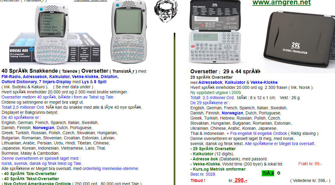
(Hover mouse pointer on the picture above to expand for readability.)
There are two search bars on the same page which creates confusion to which one to use if each search bar has a different data source. Unlike Arngren, Coursera’s search bar had a notation to help the user to understand what to write in the search bar.
There are 3 different index links again repetition and redundancy.
While there is a menu bar on the left they decided to add more information in the middle of the page which conflicts which is in the middle of the purchasable contents.
(The list numbering correspones to the circled numbers in the picture above.)
Layout
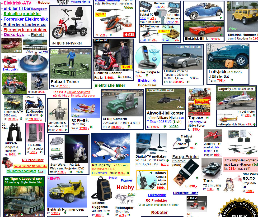
The layout of the website is not up to the expected level of user-friendly. It is clustered with boxes that each contains a product images with little to no information. In addition to the latter each box has their own format meaning no consistency in design. The images being close together with no indentation, white space, pattern or color scheme makes it irritating to browse. All sort of different products is near each other instead for instance, grouping all bikes to the left, cars in the middle and gadgets to the right. Text links with no color scheme are mixed with the boxes mentioned previously while also not providing a hover-to-show text to know what its intention is.
Behaviour
There is no notable behavior since Arngren is somewhat using plain html. But I could deduce that it has many pop-ups and that the website is not secured (uses http instead of https) that added with the fact that it is a market place, where you have to input your critical bank information to purchase products is simply wrong and unethical.
Web technologies
Lorem ipsum dolor sit amet, consectetuer adipiscing elit.
Web Technology |
Short Description |
|---|---|
Client and server sided JavaScript |
JavaScript is a lightweight, object-oriented, cross-platform scripting language, often used within web pages. |
Embedded and Inline CSS (No External CSS) |
Embedded Cascading Style Sheets define a set of style rules in a "style" element within a web page. |
HTML Transitional 4.0 Markup Language |
Transitional version of HTML. |
Cookies expiring month remaining (days not implemented) |
Persistent cookies with an expiration time between 1 month and 1 year. |
Image File Formats |
JPEG (Joint Photographic Experts Group) is a lossy compression to store images. |
Non-Secure Cookies |
Non-secure cookies may be used via an unencrypted connections. |
Invalid SSL Certificate Authority |
The SSL certificate is invalid because it is not issued for the domain where it is used. |
(W3Techs, 2020)
Overall functionality
The overall functionality is unacceptable even with two search bars the result is still very basic as seen below I searched for cars and it returns with unrelated query such as helicopters and rc-bil (children toys). (reference below)
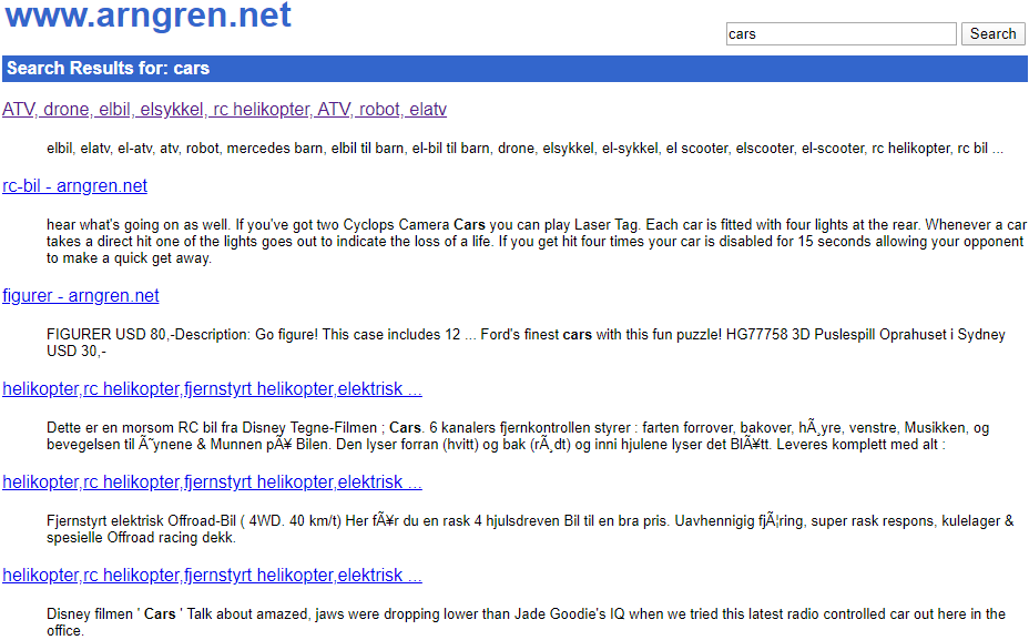
(Hover mouse pointer on the picture above to expand for readability.)
Arngren being a marketplace should have different currency for foreigners. Purchasing a product is almost impossible (you can try for yourself) even with the help of a translator. They do not have a payment portal but rather takes payment as queries that are send via Fax or Letters to their address which is very inconvenient and outdated in 2020 where technology thrives with contactless payment etc.
More focused towards functionality some images are missing, the layout is getting overlapped with each over making some text unreadable as seen in the image below.
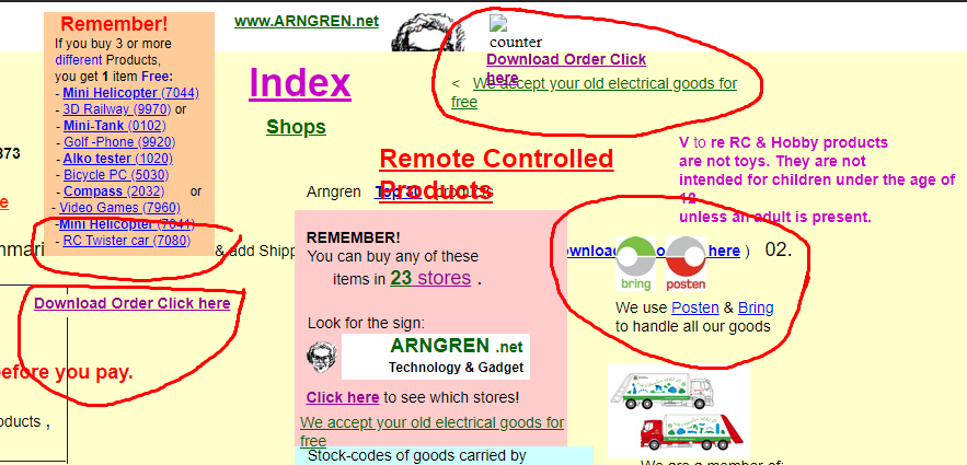
(Hover mouse pointer on the picture above to expand for readability.)
User experience
The user experience is very poor. Firstly, users will probably leave the website as soon as they see the home page as it looks so clustered to be able to comprehend as well as the design looks like a website that might contain viruses. That added with the non-working functionality makes it unbearable to browse and look for a specific item not to mention the lack of payment information. As a user it felt like the website was made in the 90s which is not a good impression.
Overview of aspects
Sells odd products that might interest some group of people
Overview of aspects
No HTML header icon
Repetition and redundant information all across the UI
Not HTTPS secured
Does not show price in other currency
Overlapping UI makes information unreadable
Lack of basic payment method

